Launchpad
- RoleSenior UI/UX Designer & Frontend Developer
- ResponsibilitiesUser research, wireframes, concepts, prototypes, product design, AngularJS development, HTML, CSS, JavaScript
- CompanyCSR Limited
- When2014 - 2019
Customers want a dashboard
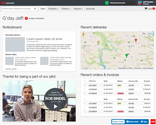
One of the first new screens I designed for CSR Connect was the dashboard - the hero of the application where everything is brought together in one handy place. The problem was, over time we assumed customers wanted to see every feature on the dashboard, maybe even some relevant media content - which lead to a slow and cluttered experience of trying to get to your first task in Connect.
The team collaborated on determining a new, smarter design for data appearing on the dashboard - but we couldn't justify the time to research, validate and then build the new solution.
A design sprint was convened to find a solution to get new users across the feature set of Connect, and the outcome was that we could simply provide greater visibility of features up front, rather than go down a longer exercise of enhancing our existing 'tour' framework - I was entrusted to design something simple we could A/B test with new customers.
Keep it simple, purposeful
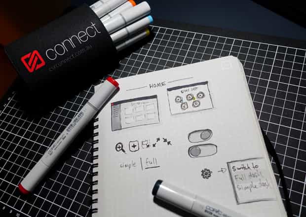
To be honest, not a lot of sketching was required to conceive the first designs for the new, simplified dashboard.
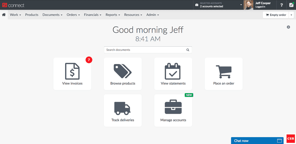
I simply took the 6 key features that the design sprint had identified as our customer "aha!" moments; those moments and stories that had proven to deliver real value to the customer, and compelling enough to retain them for longer.
I figured by presenting them as tasks, rather than features, users would find them more intuitive and relevant to their purpose when first arriving in app.
As a secondary experiment, we also decided that we'd allow the new experience to be switched back via a small toggle. This would provide insight into a) whether customers where curious enough to find and use the toggle, and b) Which dashboard experience the customer preferred when presented with the option.
Introducing the launchpad
I dubbed the new simplified dashboard the 'Launchpad' - as it was designed to be the starting point that rocketed our users directly to their purpose for logging in to the app.
Getting internal buy-in for the feature was important, as the team and greater business had become familiar with the dashboard and all had different impressions of what their own customer research said.
It was also important to sell the new name, and break loose of the connotations the cluttered dashboard had left with the team.


